


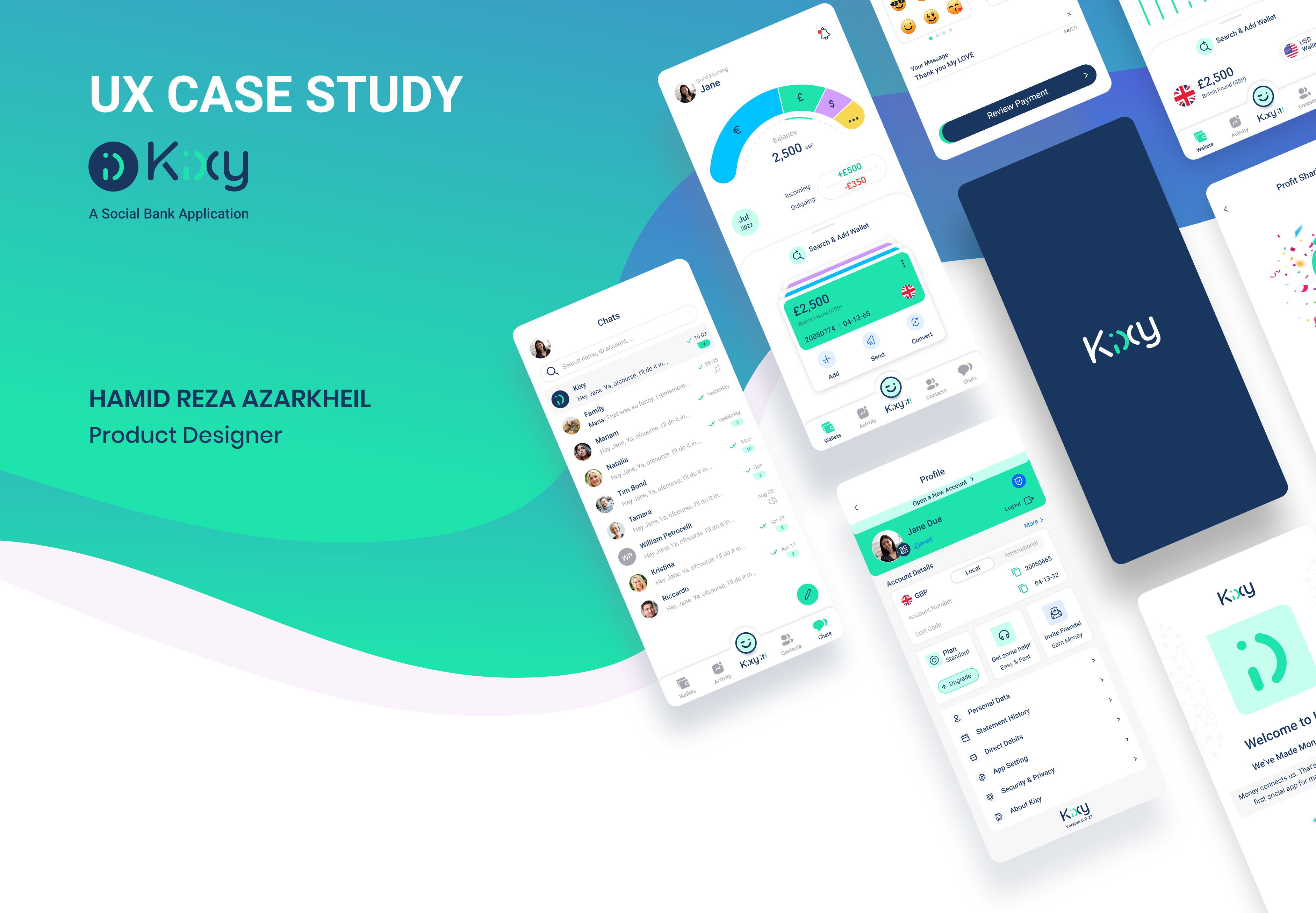
Introduction:
The objective of this project was to design a social banking app that would cater to the evolving needs of consumers by providing a unique and engaging user experience. Kixy, as a start-up, aimed to create a comprehensive solution that would not only make it easier for its users to manage their finances but also stand out in a highly competitive market. The challenge for me was to create a user-friendly, secure, and seamless app that met the needs of the target audience and provided a new level of convenience and ease for users looking to manage their finances through their smartphones.
Problem Definition:
The problem is the inconvenience and lack of trust in traditional money transfer methods, as well as the lack of engagement and fun in the process of using financial apps.
Solution:
the development of a mobile app, Kixy, to address the challenges of traditional money transfer methods. The app focuses on providing an intuitive user interface, a secure payment system, fast and easy transactions, the ability to send and receive money via emojis, and a personalized experience for users. The aim is to provide a secure, easy-to-use, and engaging mobile app that meets the needs of the target audience and revolutionizes the way people send and receive money.
- Design Process
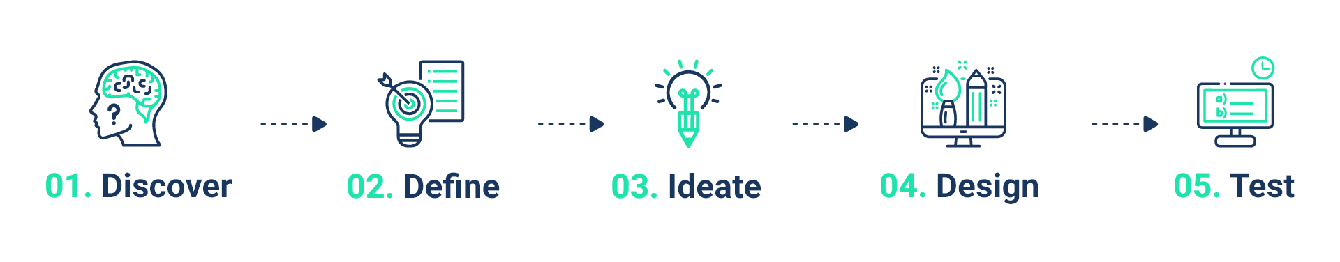
01. Discover Phase
Research:
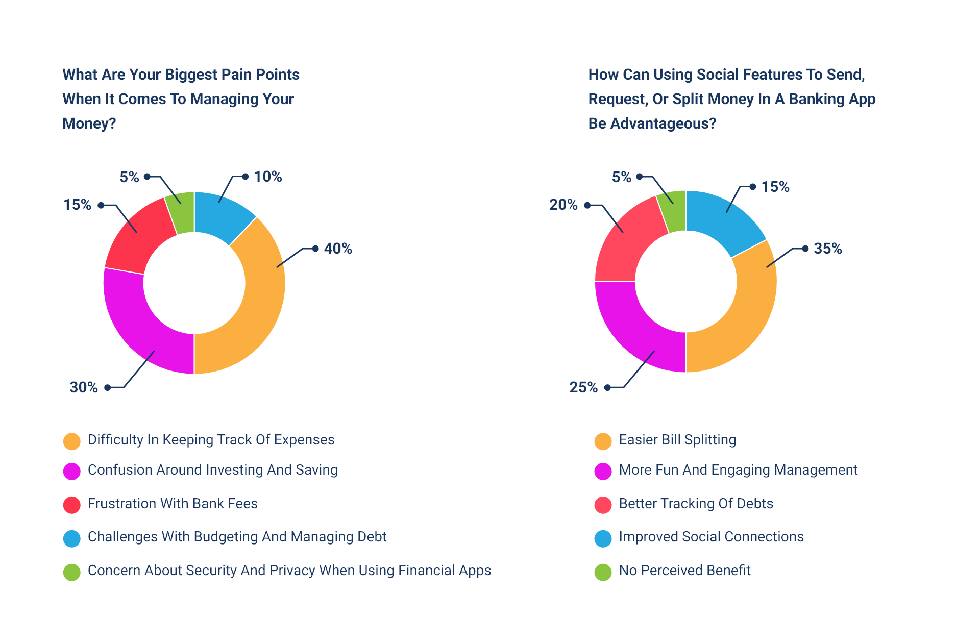
I conducted user research through surveys, focus groups, and one-on-one interviews to validate the problem definition and gain a deeper understanding of the target audience's needs and behaviors. User personas were developed based on this information, and a competitive analysis was conducted to differentiate Kixy from similar social banking apps. The research findings were used to create an empathy map and identify the necessary features for the chat and social sections of the app, such as request money and split money.
Key Insights Derived From The Interview:
I conducted in-person interviews with a diverse group of individuals in the target demographic. The interviews were used to gain a deeper understanding of the users’ needs, pain points, and goals when it comes to managing their money. I asked open-ended questions and listened actively to the participants, taking notes and recording the interviews for later analysis.
Competitive Research:
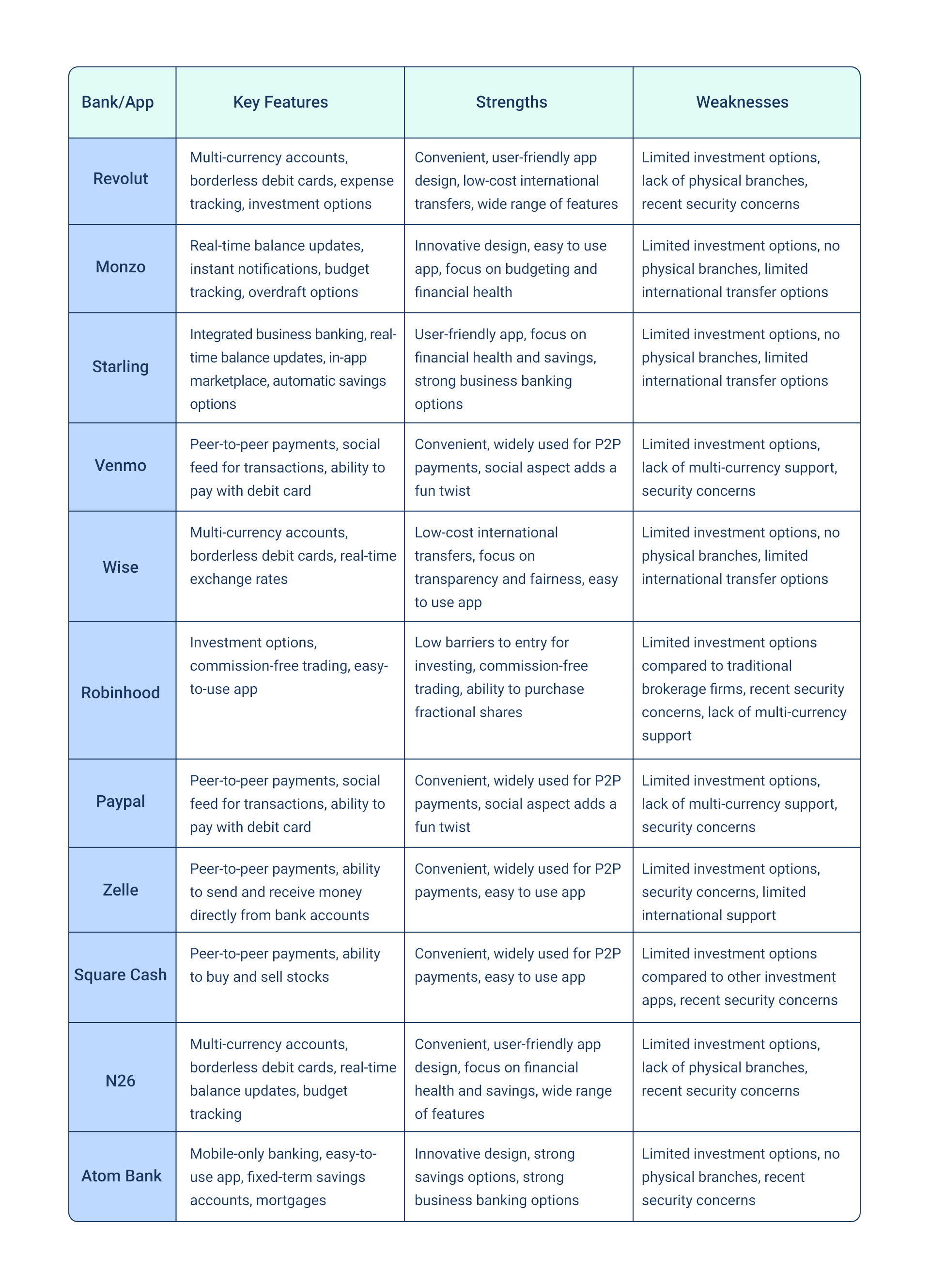
I conducted a comprehensive competitive analysis to gain a comprehensive understanding of the social banking app market and identify key players. The research focused on evaluating user experience, features, security, and user reviews of popular fintech apps and UK digital banks.
Based on the research, I identified opportunities to differentiate Kixy from the competition, such as adding the ability to send money using emojis and improving budget tracking and expense categorization in terms of making this process more intuitive and user-friendly. The competitive research informed the design solution and helped prioritize essential features and functionalities for Kixy to provide a comprehensive solution for customers.
02. Define Phase
Persona Development:
Based on the research findings, the design team created personas to represent the target users and their needs, motivations, and goals. The personas were used throughout the design process to ensure that the app was designed with the end user in mind.
1. Persona1:
Mary, 32-year-old working mom, Monthly income: $5,000, who is busy and always on-the-go. She is looking for a financial management solution that will help her keep track of her finances and simplify her life.
Pain Points:
• Time constraints and difficulty managing finances on the go
• Safety concerns with traditional banking methods
• Difficulty keeping track of spending and budgeting
2. Persona2:
Tom, 25-year-old student, Monthly Income: £800-£1000 who is seeking a solution to manage his finances while he is studying. He has limited financial resources and is looking for a budgeting and spending tracking app that is affordable and easy to use.
Pain Points:
• Difficulty keeping track of spending and budgeting
• Need for an easy way to split bills and expenses with friends
3. Persona3:
Emily, 42, Budget-Conscious Retiree, Monthly income: £1,500 who is conscious of her spending. She has a limited monthly income and wants to make sure that her money goes as far as possible. She is looking for a solution that will help her manage her finances effectively and ensure that she stays within her budget.
Pain Points:
• Concerns over security and privacy of personal financial information
• Difficulty in keeping track of spending and budget
• The need for a simple, easy-to-use solution to manage finances
• The inconvenience of having to switch between different apps to send and receive receipts
By understanding the pain points of these personas, I can prioritize features and design solutions that address the most pressing needs of its target audience.
Empathy Map:
An empathy map was created to better understand the target users and their pain points, motivations, and goals. The empathy map provided valuable insights into the user experience and was used to inform the design solution.
Here's an empathy map for each of the personas:
Persona 1:
Mary, 32-year-old working mom, Monthly income: $5,000, who is busy and always on-the-go. She is looking for a financial management solution that will help her keep track of her finances and simplify her life.
Feelings:
• Stressed
• Overwhelmed
• Anxious
• Frustrated
Thoughts:
• "I need a quick and easy solution for managing my finances."
• "I want to make sure my financial information is safe."
• "I need to be able to keep track of my spending and budget."
Needs:
• Convenient and easy-to-use financial management tools
• Security measures to protect financial information
• Budgeting and spending tracking tools
Actions:
• Checking bank statements and transactions on the app
• Transferring money between accounts
• Paying bills and making purchases directly through the app
Visualize:
• A busy working mother multitasking
• An image of a secure vault or padlock symbolizing safety
• A visual representation of a budget and spending tracker
Persona2:
Tom, 25-year-old student, Monthly Income: £800-£1000 who is seeking a solution to manage his finances while he is studying. He has limited financial resources and is looking for a budgeting and spending tracking app that is affordable and easy to use.
Feelings:
• Frustrated
• Embarrassed
• Anxious
Thoughts:
• "I need a way to keep track of my spending and budget."
• "It's difficult to split expenses with friends without feeling awkward."
Needs:
• Budgeting and spending tracking tools
• A simple and efficient way to split expenses with friends
Actions:
• Checking bank statements and transactions on the app
• Sending and receiving money with friends through the app
• Paying bills and making purchases directly through the app
Visualize:
• A student juggling multiple expenses and trying to budget
• Friends splitting a bill or expenses
• A visual representation of a budget and spending tracker
Persona 3:
Emily, 42, Budget-Conscious Retiree, Monthly income: £1,500 who is conscious of her spending. She has a limited monthly income and wants to make sure that her money goes as far as possible. She is looking for a solution that will help her manage her finances effectively and ensure that she stays within her budget.
Feelings:
• Anxious
• Frustrated
• Confused
Thoughts:
•"I want to make sure my personal financial information is secure."
•"I need a solution that is easy to use and helps me keep track of my spending."
•"I don't want to have to switch between different apps to manage my finances."
Needs:
• A secure and private platform to manage finances
• An easy-to-use and simple solution to manage budget and spending
• A single platform for sending and receiving receipts
• Clear and straightforward budgeting and spending tracking tools
Actions:
• Checking bank statements and transactions on the app
• Transferring money between accounts
• Paying bills and making purchases directly through the app
• Keeping track of income and expenses
• Sending and receiving receipts through the app
Visualize:
• A retiree managing finances and budget
• A visual representation of budget and spending tracking tools
• A secure and private platform for financial management.
03. Ideate Phase
Conceptualization:
Based on the research and analysis conducted for Kixy, I generated several ideas and concepts for the design solution. These concepts focused on creating a user-friendly fintech app that would make it easy for users to manage their finances, complete tasks and access the features they need.
I considered the target audience and their specific needs, as well as the strengths and weaknesses of existing fintech apps in the market. The concepts were then reviewed and refined based on feedback from stakeholders, ensuring that the final design solution would meet the needs of the target audience and differentiate Kixy from its competitors.
Prototyping:
After the conceptualization stage, I created low-fidelity prototypes of the design solution for Kixy using XD. These prototypes allowed me to test the basic functionality and overall flow of the app, as well as gather feedback from potential users.
I conducted user testing sessions with a select group of individuals to get their reactions and feedback on the app's design, usability, and user experience. Based on the feedback received, I made iterations and refinements to the design to ensure that it met the needs of the target audience and would deliver an intuitive and seamless experience for Kixy users.
This stage was crucial in ensuring that the final product would meet the expectations and requirements of Kixy's users and help achieve its goal of simplifying the process of sending money and making payments.
User Testing:
I conducted user testing to gather feedback on the prototypes. A diverse group of potential users was selected to participate in the testing to ensure that the design met the needs of a wide range of users. During the testing, the participants were asked to complete tasks and provide feedback on the app's functionality and overall user experience.
The testing was conducted in a controlled environment to ensure that the results were reliable and accurate. The results were analyzed to identify any pain points or areas for improvement. Based on this feedback, the design team made refinements to the design, ensuring that the final product was user-friendly, intuitive, and met the needs of the target audience. The user testing was an integral part of the design process and helped to ensure that the app was delivering a seamless, enjoyable user experience.
User Journey:
A user journey was created to visualize the steps the user would take to complete a task or achieve a goal. The user journey was used to ensure that the design was intuitive and user-friendly.
The following steps outline user journey for sending money through the Kixy app:
1. Open the Kixy app: The user opens the Kixy app on their mobile device.
2. Navigate to the send money section: The user navigates to the "Send Money" section of the app, which is typically located in the main menu or accessible through a prominent button.
3. Select the recipient: The user selects the recipient from their list of contacts within the app or manually inputs the recipient's information.
4. Input the amount: The user inputs the amount they wish to send.
5. Review and confirm the transaction: The user reviews the transaction details, including the recipient, amount, and any fees or charges, and confirms the transaction.
6. Enter payment information: If the user is sending money for the first time, they will be prompted to enter their payment information, such as a debit or credit card.
7. Send the money: The user sends the money by confirming the transaction.
8.Receive confirmation: The user receives confirmation of the successful transaction and can view the transaction details in their transaction history.
9. Option to send receipt: The user has the option to send a receipt of the transaction to the recipient through the Kixy app or another social platform.
10.Log out: The user logs out of the app or closes it to complete the transaction.
04. Design Phase
Interaction Design:
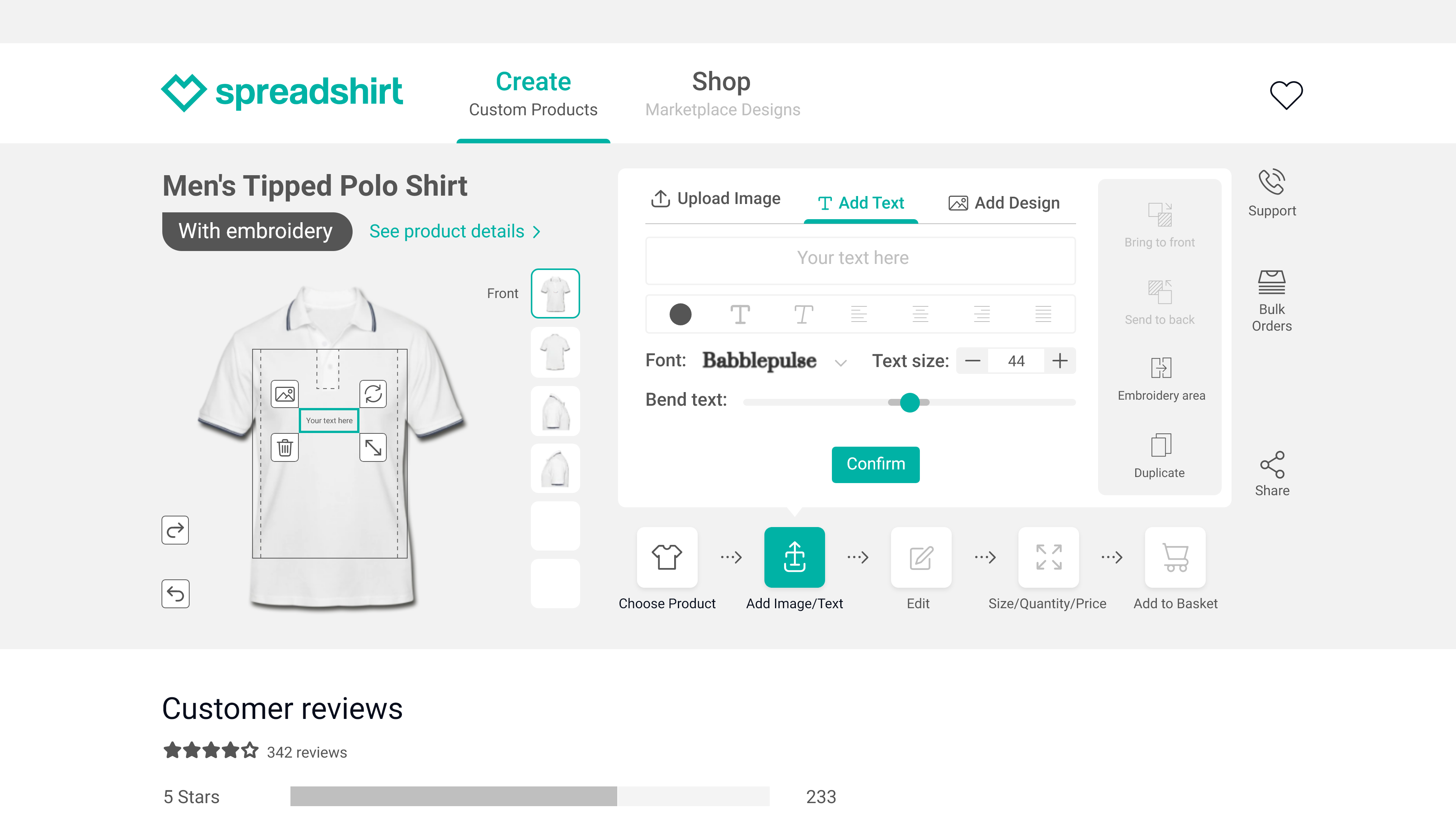
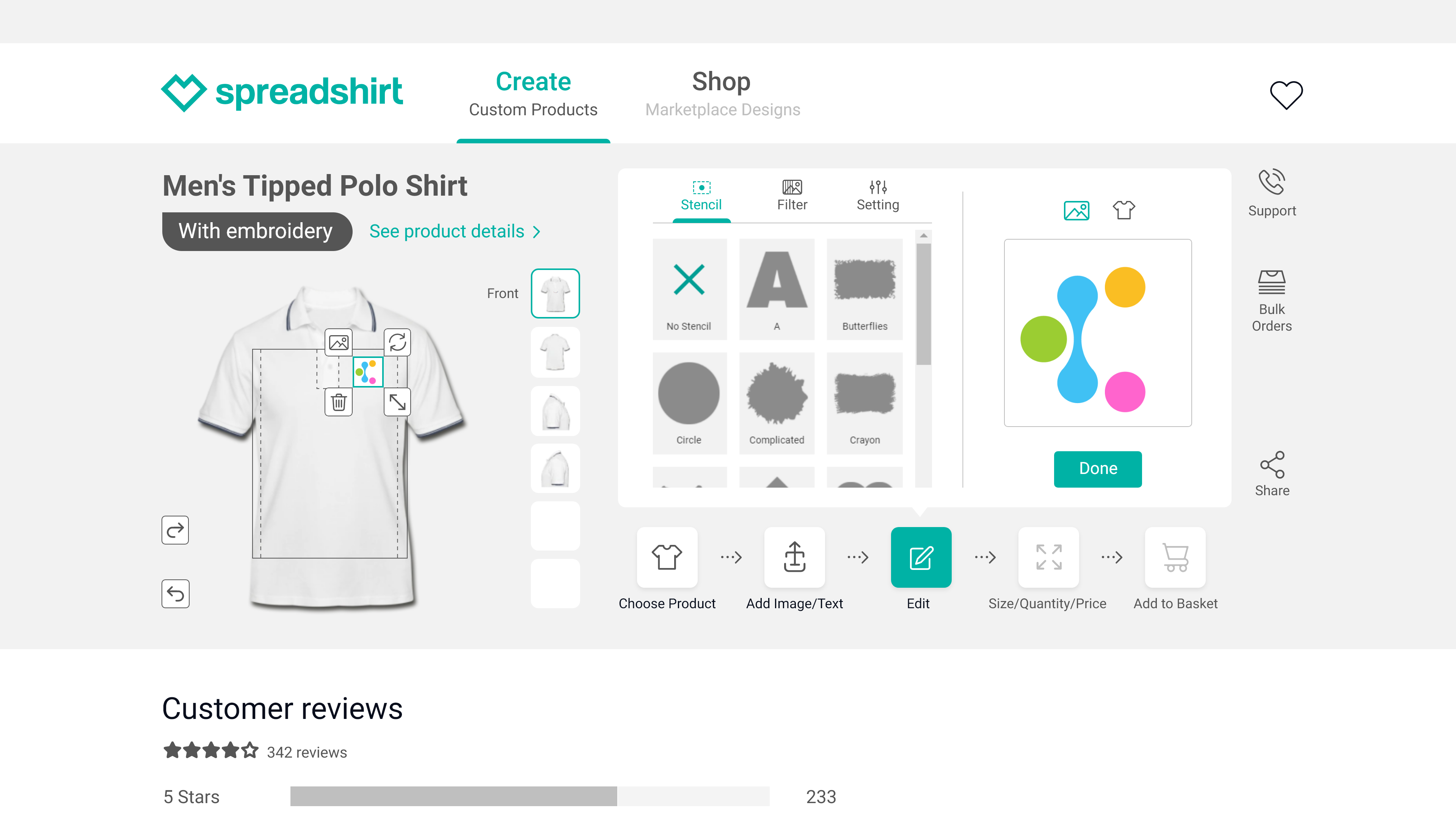
In the interaction design process, I defined the behavior of the app and how users would interact with it. I focused on creating a user-friendly interface that would make it easy for users to complete tasks and access the features they need. Interaction design involves defining the behavior and interactions between users and the app.
This process is critical in creating an intuitive and user-friendly interface. I created wireframes, prototypes, and user flows using Adobe XD, which allowed me to test the app's functionality and refine the design based on user feedback.
My goal was to create a clean and simple interface that would be intuitive and easy to use. Additionally, I made sure that the app's navigation was straightforward and that users could access features quickly and easily. The interaction design was an important part of the overall user experience and was key to making the app a success.
One of the key elements of interaction design is creating a clean and simple interface that is easy to use. This involves designing an intuitive navigation system, so users can access the features they need quickly and easily.
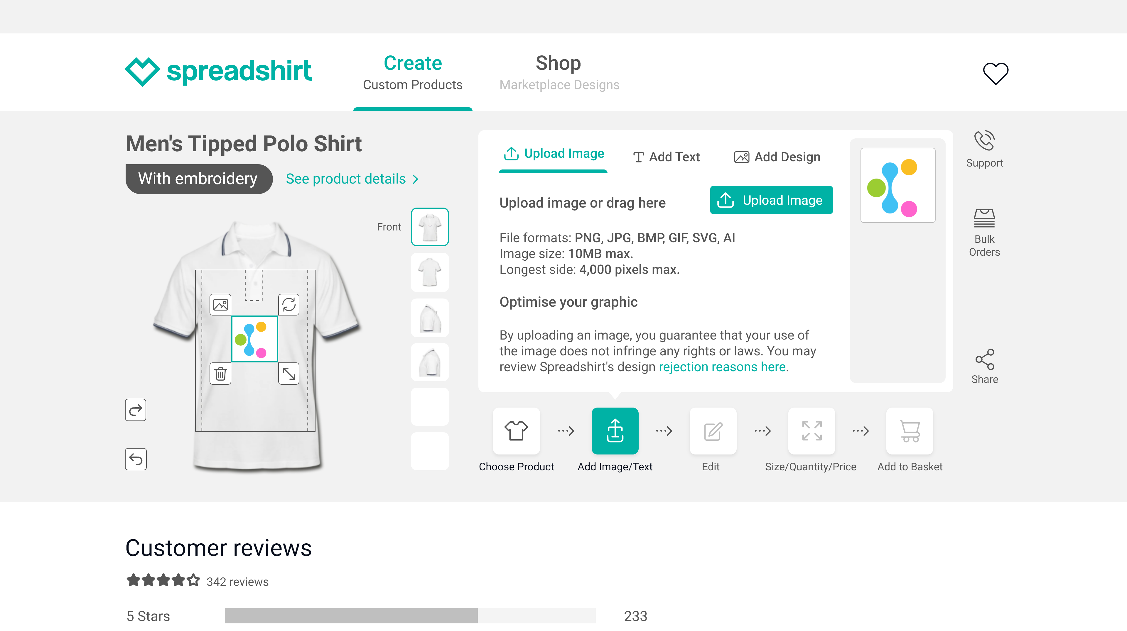
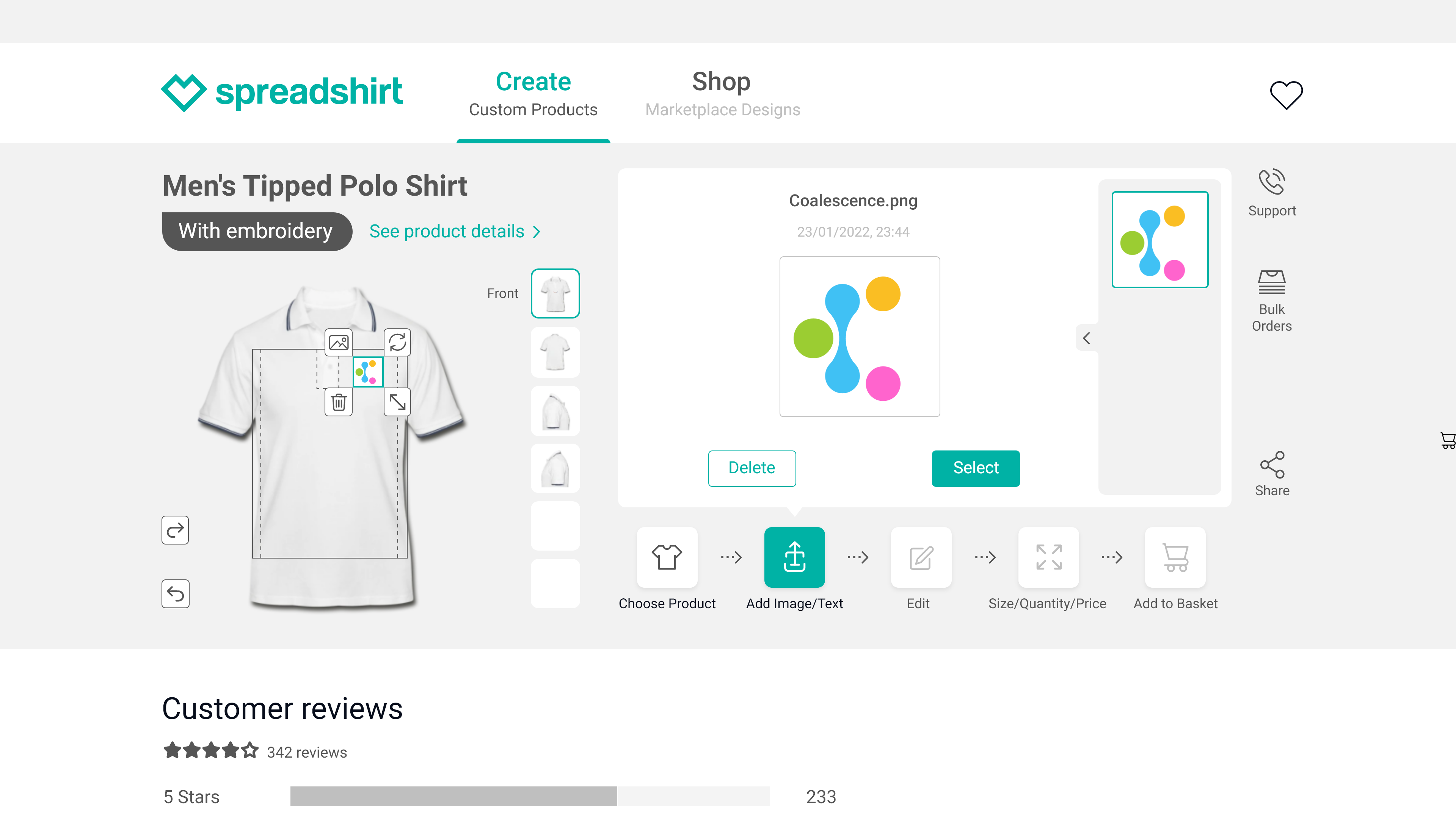
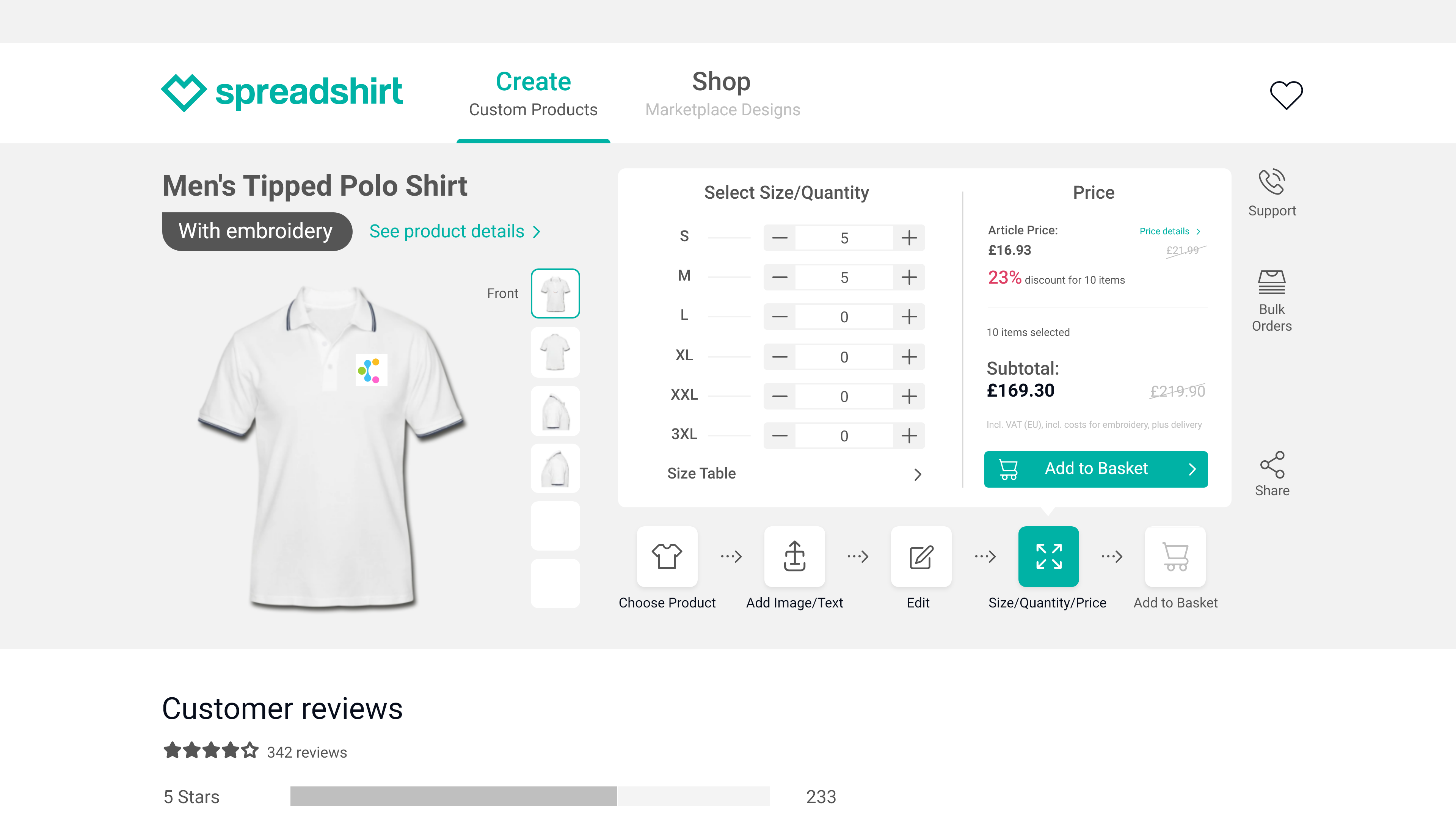
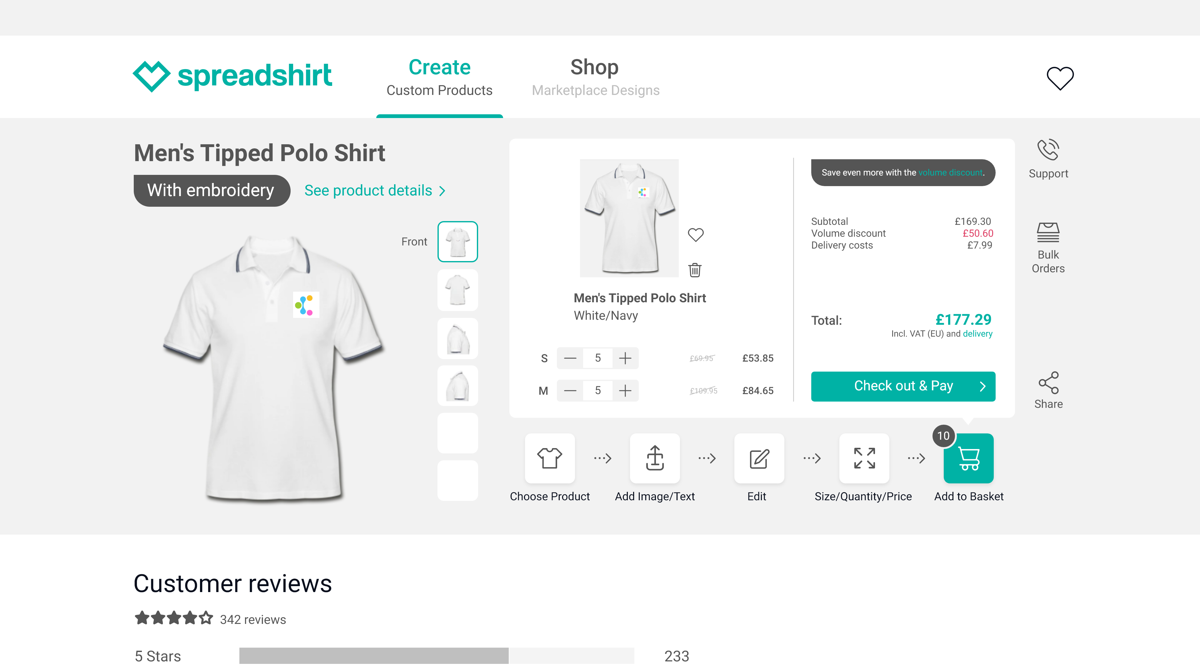
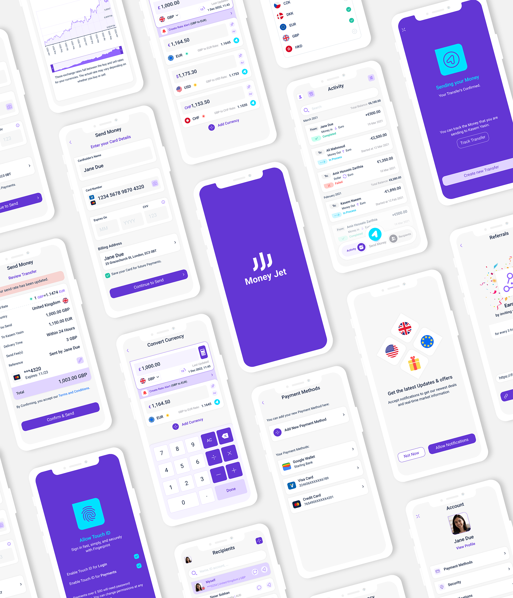
For example, in the app, sending money to friends and family should be a seamless process. I designed the user flow for sending money to be straightforward, so users can quickly complete the task with just a few taps. Additionally, I added a fun touch by allowing users to send money using emojis, which added a unique twist to the traditional process of sending money.
Overall, the interaction design process was an essential part of creating a successful app, as it defined how users would interact with the app and shaped the overall user experience.
Visual Design:
I developed the visual design elements such as typography, color, and imagery to enhance the overall user experience. The visual design was used to make the app appealing and engaging to the target audience. I carefully considered the typography choices to ensure clear readability and a consistent visual language. The color palette was selected to be modern and visually appealing, while also promoting a sense of trust and security.
Additionally, I designed a unique pack of emojis to add personality and a touch of fun to the app, making it more engaging and memorable for users. The images used in the app were carefully selected to be relevant, visually appealing and to reinforce the brand identity of Kixy. Overall, the visual design of the app was created with the goal of delivering an enjoyable, accessible and intuitive experience for users.
Implementation:
The design was translated into a functional product through a multi-step process that involved development, testing, and quality assurance. The development team worked closely with me to ensure that the design was implemented as intended and met all requirements and specifications.
I used Zeplin to facilitate effective collaboration and communication between the design and development teams. The development process followed an Agile methodology, which allowed for quick iterations and continuous improvement. During this phase, I was responsible for monitoring the progress of the development team and ensuring that any issues or obstacles were addressed promptly.
Additionally, I collaborated with the testing and quality assurance teams to conduct thorough testing of the app to identify any bugs or technical issues. The goal of the implementation phase was to create a high-quality and seamless user experience that met the needs of the target audience. Tools used in this phase included project management software, bug tracking tools, and code development tools.
05. Test Phase
Evaluation:
The final step in the UX design process was to gather feedback from users and stakeholders and make improvements to the design as needed. I monitored the app's performance using tools such as Google Analytics, and UserTesting to gather data on user behavior, app usage, and areas for improvement. I also conducted user surveys, focus groups, and in-person interviews to gather qualitative feedback on the app's overall user experience. For instance, I asked users about their experience with sending money within the app.
I also sought feedback on unique features such as sending money through the use of emojis, which allows users to quickly and easily send money to friends and family with just a few taps. Based on the results of this evaluation, I made ongoing improvements to the design, ensuring that the app met the needs of the target audience and delivered a seamless, intuitive user experience.
Conclusion:
The design process for Kixy's social banking app was comprehensive and focused on providing a unique and engaging user experience. By conducting user research, creating personas, conducting competitive research, creating an empathy map, and testing and refining the design, the end result was a product that met the needs of the target users and set Kixy apart from the competition. The soon-to-be-launched app offers a comprehensive solution for managing finances, with multi-currency accounts, a borderless debit card, and exciting social features.


